
Azeroth’s visual style is often praised for its artistic charm, but beneath the vibrant hues and fantastical landscapes lies a sophisticated design system built around color gradients. These gradients aren’t just aesthetic choices—they subtly guide movement, focus attention, create emotional cues, and shape how players navigate each zone. Blizzard’s art teams use light, saturation, and shifting tones to make exploration feel intuitive, layered, and emotionally resonant, all without explicit UI markers.
This article explores how WoW’s use of color gradually leads players through environments, directs their attention, and enhances narrative themes across expansions.
The Psychology of Color in Open-World Exploration
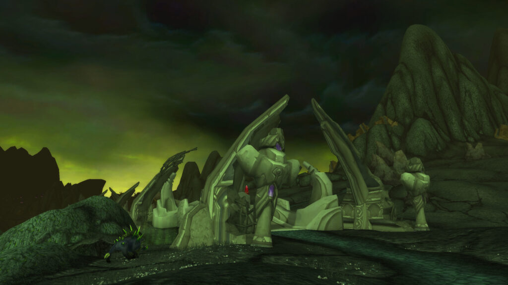
The human eye naturally gravitates toward areas of contrast and saturation. WoW’s artists use this instinct to influence movement. Bright areas invite exploration, dim areas suggest danger or depth, and warm gradients create emotional warmth while cool tones hint at mystery. Without players realizing it, color becomes a form of environmental storytelling that nudges them toward key paths, landmarks, and quest objectives.
This silent guidance creates a natural flow through each zone.
Guiding Players Through Zonal Progression
Zones are often designed with sequential gradients that visually mark progression. Starting areas may be warm, soft, and lightly saturated, while deeper regions shift toward darker or more intense colors to indicate challenge. This layered design helps prevent players from becoming lost and reinforces narrative beats as they move through evolving landscapes. Zones feel like journeys, not random collections of terrain.
Color gradients let players intuitively sense when they’re moving toward danger or safety.
Color as a Landmark System
Before quest trackers and modern UI improvements, color acted as the primary guiding tool for navigation. Even today, memorable zones use unique palettes to create visual anchors that help players remember paths. A bright red crystal formation, a blue-tinted forest, or a golden cliffside becomes a reference point. Zones with distinctive color shifts make navigation simpler and create mental maps players rely on subconsciously.
Color helps players orient themselves even in complex environments.
| Color Gradient | Design Purpose | Zone Examples |
|---|---|---|
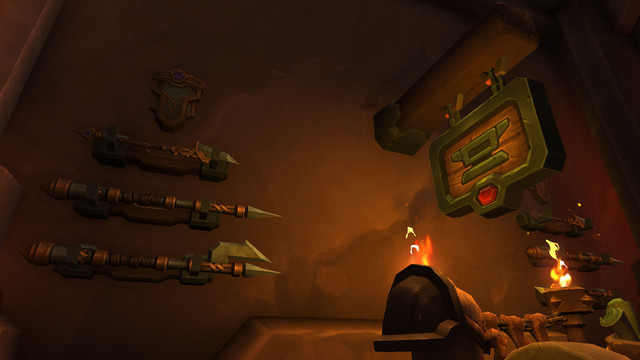
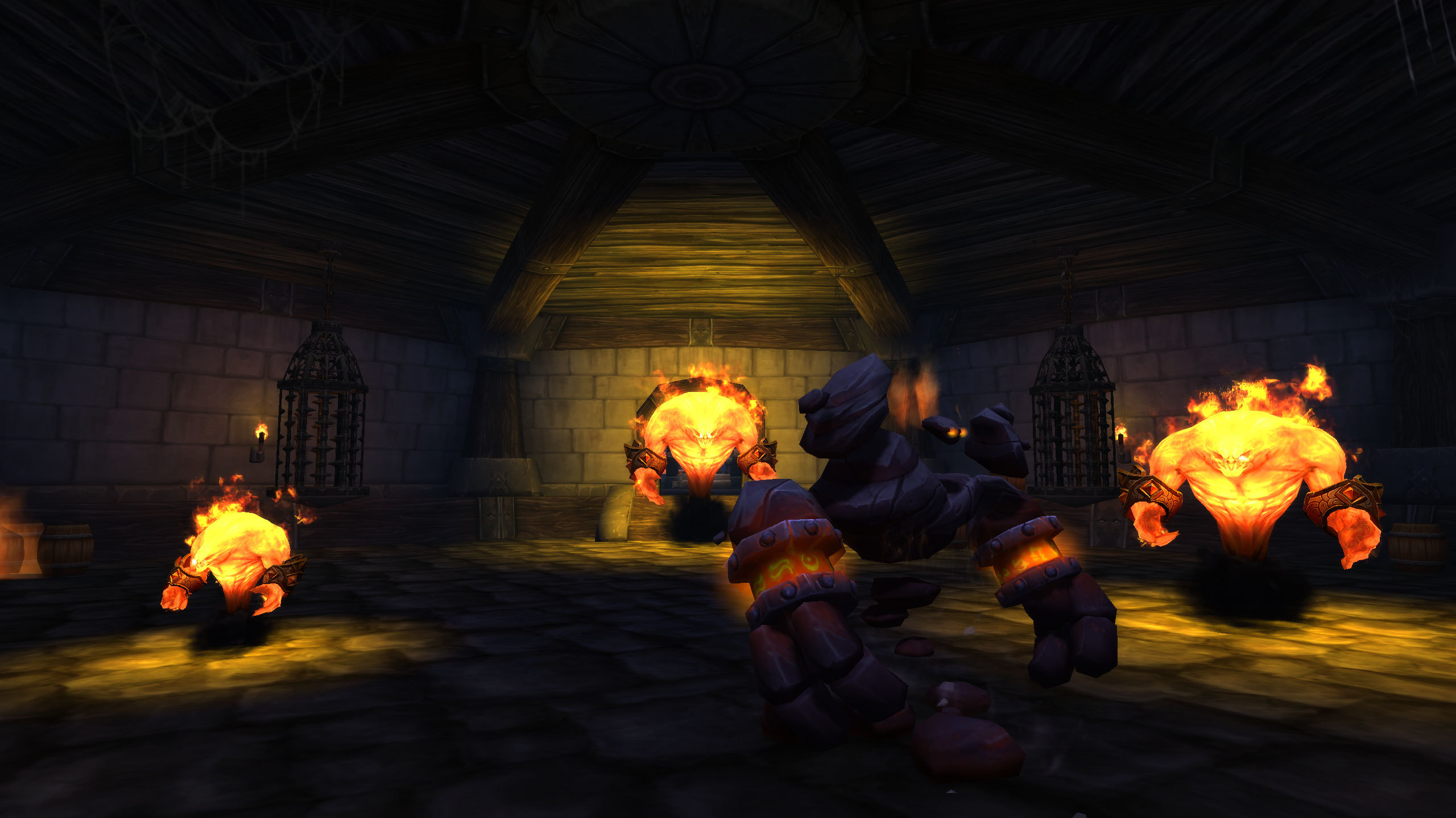
| Warm → Fiery Reds | Indicate conflict or danger | Searing Gorge, Firelands |
| Soft Greens → Deep Blues | Transition from safety to mystery | Feralas, Ashenvale |
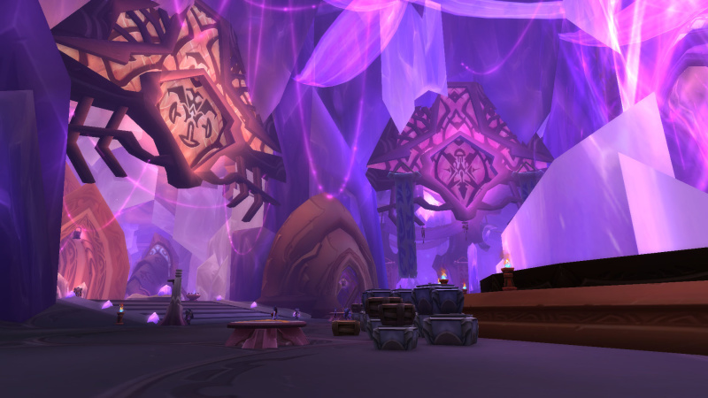
| Gold → Twilight Purple | Signal magical corruption or cosmic energy | Suramar, Twilight Highlands |
| Pale Whites → Cracked Dark Stone | Represent environmental decay | Icecrown, Maldraxxus |
| Bright Blues → Teal/Black | Show increasing arcane intensity | Azsuna, Nexus zones |
Leading Players to Points of Interest
Important areas such as quest hubs, flight masters, dungeon entrances, or narrative set pieces often stand out through deliberate color contrast. An otherwise muted forest may contain a bright torch-lit camp, or a snowy field might center around a warm orange glow indicating civilization. These contrasts don’t break immersion—they enhance it by blending natural cues with gameplay needs.
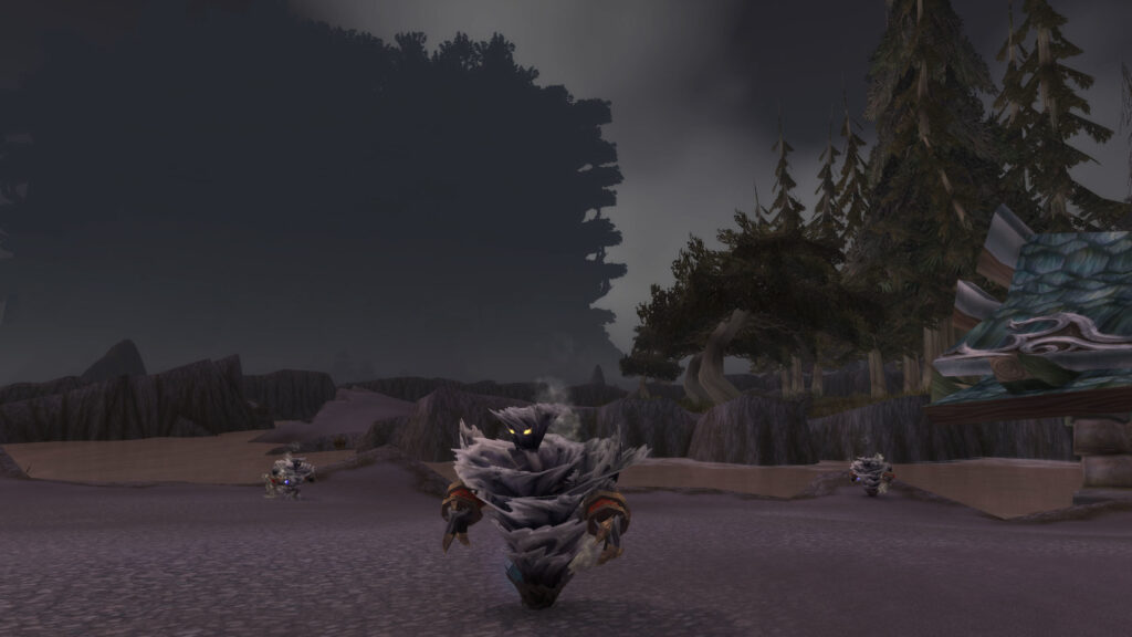
Subtle color changes ensure players rarely miss key areas even without reading map markers.
How Zones Tell Stories Through Color
Zonal storytelling often begins with color. The bright golds and reds of the Barrens evoke heat and harshness. The pastel greens of Elwynn Forest create serenity and safety. The eerie purples of Netherstorm hint at unstable magic. Color gradients reveal narrative tone before dialogue or quests ever do.
Even players who skip text absorb story cues subconsciously through these visual choices.
The Evolution of Color Use Across Expansions
Classic WoW relied heavily on strong, simple gradients to guide movement. Burning Crusade embraced vibrant saturation to reflect alien worlds. Wrath shifted to icy blues and greys to reflect loss and decay. Battle for Azeroth used contrasting color identities between Kul Tiras and Zandalar to reflect cultural differences. Dragonflight introduced dynamic lighting and reactive color shifts to support its high-fantasy style.
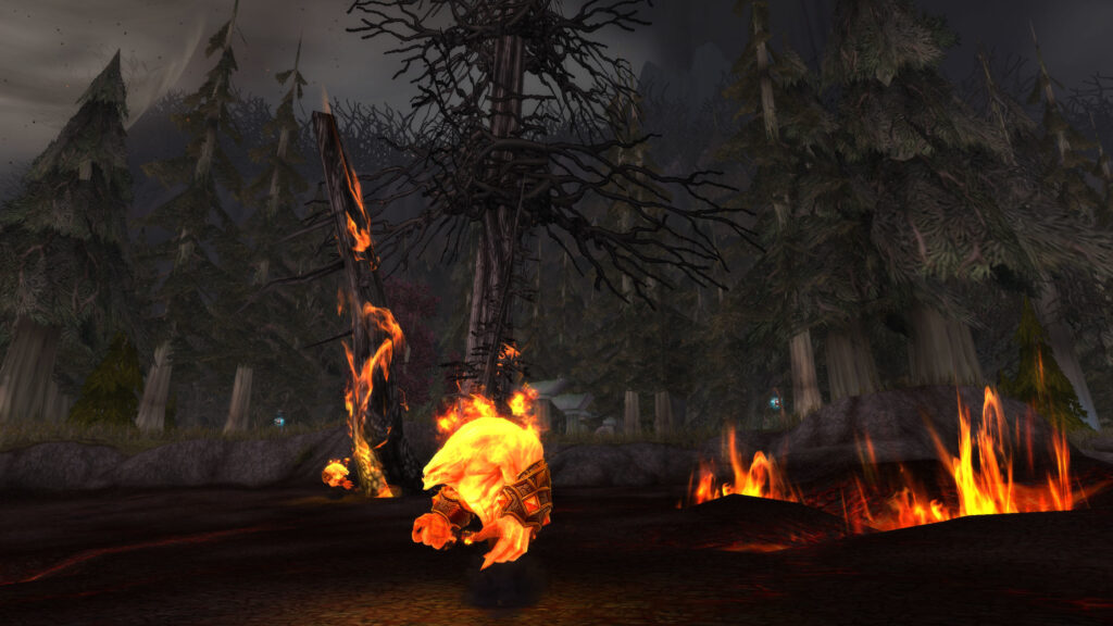
Each expansion reflects its thematic core through color before players read a single line of story.
Dungeons and Raids: Color Gradients as Encounter Navigation
Color is also used inside instanced content. Raids often use gradients to guide players toward bosses or important mechanics. A path might shift from dark purples to glowing oranges to indicate a transition toward a final confrontation. Dungeons use gradients to help differentiate wings, identify puzzle rooms, or signal environmental hazards. These subtle cues ensure players never feel visually lost even in labyrinthine layouts.
Without gradient evolution, many multi-wing dungeons would feel disorienting.
Emotional Resonance Through Color
Color gradients don’t only serve gameplay—they evoke emotional responses. Bright sunrise tones evoke hope. Deep crimson sunsets suggest looming conflict. Cool twilight gradients create mystery or melancholy. When players enter a new expansion, color often determines their first emotional impression. Designers craft these palettes with the intention of shaping how players feel as they move through story arcs.
Color becomes a companion on the player’s journey, not just a backdrop.
The Dragon Isles: A Showcase of Modern Gradient Mastery
Dragonflight uses gradients more effectively than nearly any expansion before it. Rolling skies shift across zones, with warm plains blending into azure coasts and crystalline peaks. Dynamic lighting enhances these gradients with real-time atmospheric shifts. These layered colors support immersive traversal and highlight the contours of the land for the new dynamic flight system.
Every gradient serves dual functions: beauty and navigation.
Conclusion
WoW’s use of color gradients is an underappreciated triumph of environmental design. These gradients guide movement, highlight story, shape emotion, and help players navigate vast landscapes without relying solely on UI prompts. They make zones feel cohesive, intentional, and alive. Through color, players experience the world on both conscious and subconscious levels, turning exploration into a visually guided journey from one hue to the next.
In a world as massive as Azeroth, color becomes the invisible hand that leads the way.